Introduction of T-shirt Printing
Anybody can appreciate a good t-shirt printing. But what characteristics do people look for in an appealing design? Even the most straightforward designs must avoid the most frequent errors in order to be excellent, even if some of the finest designs appear to be straightforward.
Here are my ten T-shirt design tips, based on 10 years of experience in the custom t-shirt and printing Print On Demand business.
1. Set a modest print size
While there may be certain situations in which size is unimportant, a t-shirt design is not one of them. People frequently make the error of setting their design to a standard size. Standard, though, is almost at the top, which might be too big for most designs.
The function of the shirt, the qualities of the material, and the features of the design itself should all be taken into account when determining the size of a design.
Remember that some forms, like circles and squares, appear better when they are scaled down from their normal size. Think about the print’s whole surface area rather than simply its width and height.
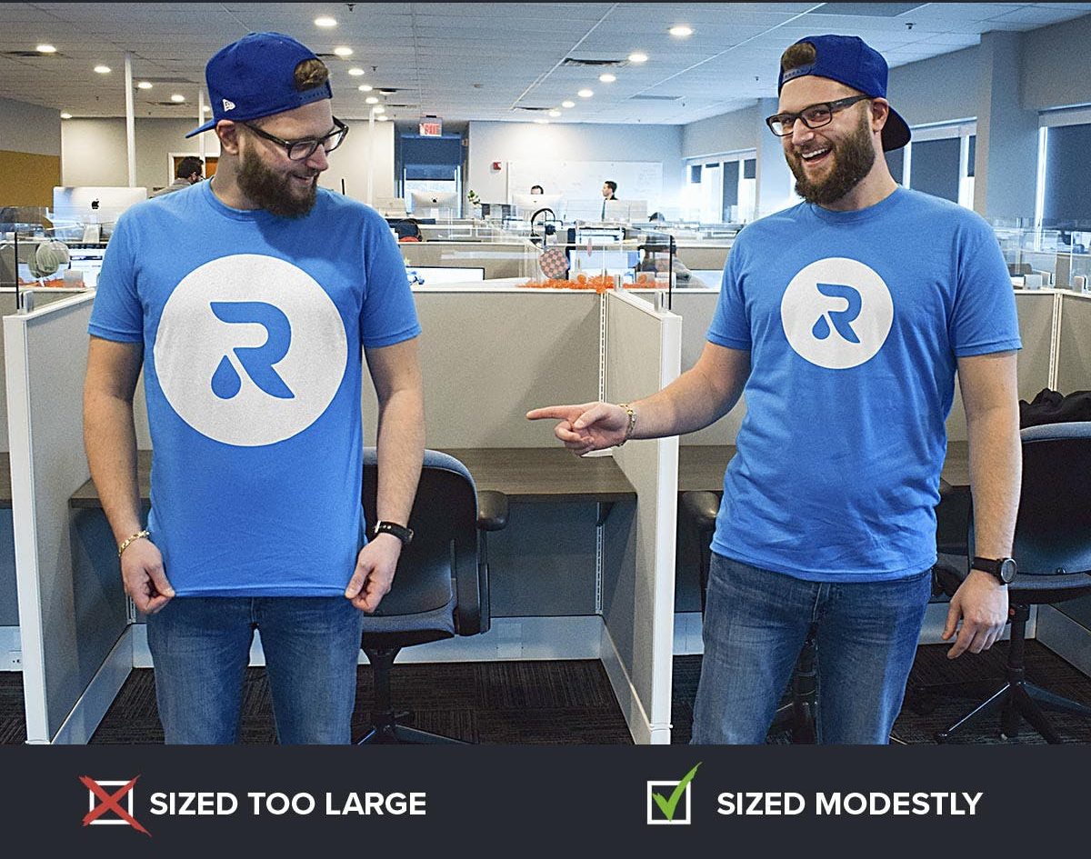
Other factors to consider while sizing:
No one size fits everyone. Reduce the print size on the smaller T-shirts for bigger orders that include a range of T-shirt sizes. For illustration, the chest print on youth tees and smalls is 8 inches wide, while the rest is 10 inches broad.
The print regions on some garments are constrained. Set your print size to adhere to the demands of the desired look. For instance, the design space on stank tops is substantially less than that on T-shirts, and the maximum height of hoodies with front pockets is 10 inches.
Think about comfort. Large prints may make a T-shirt heavier and less breathable, especially on thin garments. Example: A large print turns into an unpleasant “sweat patch” when used to create T-shirts for a 5K run.
Avoid using people as moving billboards. Even the most ardent supporters of your company might be hesitant to don a T-shirt that makes them appear like walking advertisements. People will be more willing to wear it if the print size is kept modest.
Conclusion: Size matters. Think carefully about the size since it may make or break a T-shirt design. Usually, smaller is preferable.
Advice: Sizing Using a home printer and ordinary paper, print your design, divide it across two or more sheets, tape the sheets together, and then trim off the excess. Then, in the mirror, hold it up to your own shirt to get a better sense of how it would seem.

2. Get the placement right
Print placement and print location are distinct. It is the precise measurement of the area where the design should be printed.
Make sure you have a valid rationale if you choose an unusual print placement. Many individuals who are new to T-shirt design are unaware that the typical full front positioning isn’t exactly halfway down the garment. In reality, it is around 4 inches from the collar. The belly print is a typical error that is never attractive.
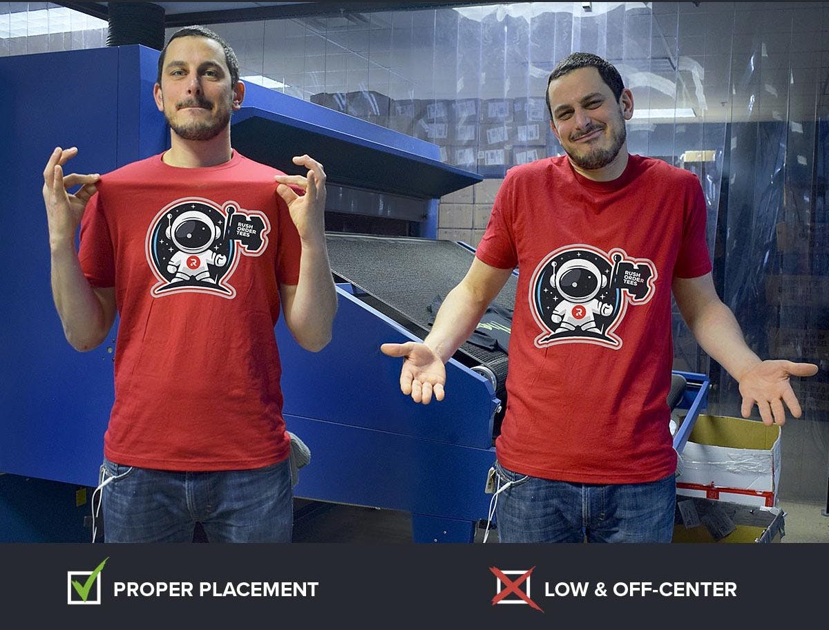
Our production staff makes sure the placement is standard and will be compatible with your various clothing kinds and sizes if your print will be in a regular spot, such as the entire front, full back, or left chest.
Just let our creative staff know if you have any unique demands or if you need a different print area. Once your approval has been received, they will confirm that your request is within the parameters, present you with digital proof, and then communicate those instructions to our printers.
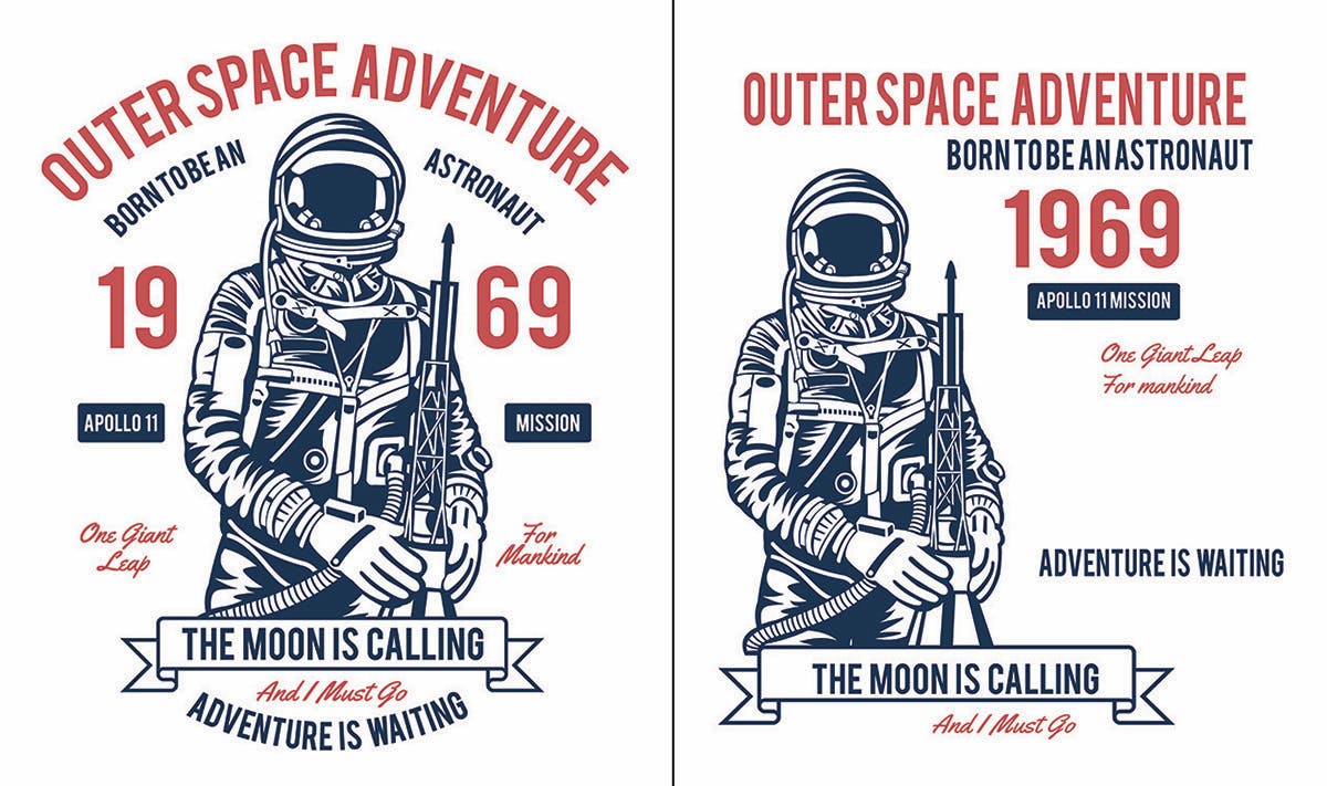
Advice: Placement Usually, the midway is used to center designs. However, not every design should. Designs that are not symmetrical (like the astronaut above) must be visibly centered. Instead of the entire design being the right center in this instance, it is the character’s middle.

3. Focus on fonts and typography
In its simplest form, typography is the visual arrangement of words (as opposed to the typeface, which is the text’s style). Typography is used whenever text is written or shown, whether it is done well or poorly.
Typography is the art of typesetting in graphic design, which includes selecting appropriate typefaces (fonts), ensuring that letter and line spacing is appropriate, and creating a visually appealing interaction between the written words and the graphic elements.
But to use proper typography, you don’t have to be a professional artist. Simply adhere to a few fundamental guidelines.
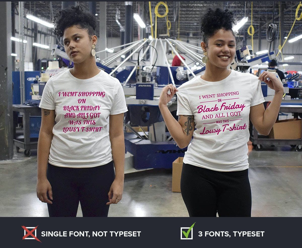
Your choice of typeface conveys a lot. It contains a lot of information and may unintentionally transmit certain thoughts or arouse particular feelings. Due to a lifetime of exposure to logos, drawings, and advertisements, we are all trained to associate particular qualities with particular typefaces.
Using the “Batman” typeface on a T-shirt for a family gathering is not the finest choice. Avoid “Comic Sans” if you’re trying for a more corporate or professional image (in all honesty, never use Comic Sans).

Some common typefaces may be used for almost everything, while others only look well in certain settings. Investigating your alternatives is time well spent. Here are some general guidelines you may use while creating a T-shirt design:
The words that are most crucial should be bolded and placed at the top.
Avoid using large block letters. You are not creating a bus side.
Use typefaces with different styles sparingly to enhance visual interest.
Take into account where you place your line breaks since they dictate how your content is read.
Layout the type’s relationship to the images with care.
A busy image should not have writing placed on top of it. It may make reading much more difficult.
If employed at all, effects like drop shadows and textures should be used sparingly.
Do you need a quick primer in typography? Practical Typography is a wonderful small site full of useful information that can address your most fundamental inquiries on the subject.
Advice: Use fonts Never use more than three different fonts in a design, if you only know one rule of typography. It gives off a hectic, disorderly appearance. Additionally, the graphic design police will pursue you.

4. Take care with composition
You might recall composition from your high school art class. Every design contains components that are positioned in relation to one another and together form the overall composition. Composition is the key to good design.
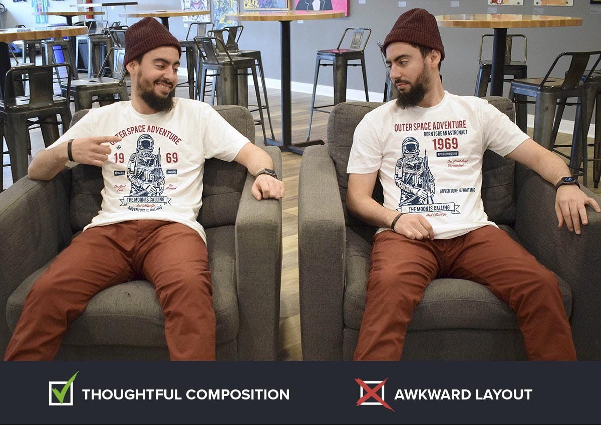
Despite what you may believe, there are certain straightforward guidelines that might help design. As the saying goes, first violate the rules, then learn them. If you want to learn how to enhance your composing game, there are a ton of materials available online.
Typical errors include parts that are too close or far off from one another. Sometimes the balance of the overall design might be improper, which draws the attention in the wrong direction. Or, if you’re very sloppy, the message is ruined when the text is read out of sequence.
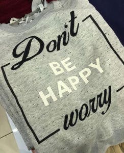
Oops. They may have had some cause for concern.
Bottom line: Spend time and effort on your composition if you’re using a range of pieces. Compare a few various layouts that you try. Find out what a buddy thinks. First, worry, then you may afterward be joyful.
Advice: Composition Utilize “fresh eyes” to examine your design. Go on an extended break, then come back to it. It’s very beneficial to do if you become stuck, upset, or have several versions produced that you need to choose from. Often, seeing something later—or better still, the next day—gives you an immediate sense of what needs to be changed or which option to pick.

5. Ensure image quality
The “low resolution” of the photos in customer-submitted art files is one of the most prevalent issues. This indicates that they lack the pixel information necessary to provide us with the quality and details required for optimal print quality.
Images should ideally have a full-size resolution of 200 dpi or above. The ideal resolution is up to 300 dpi. The resolution of web images is normally 72 dpi, not the size needed for printing.
Visible compression artifacts in low-res photos are another issue. Remember that the print will only be as clear as the image we start with, so choosing a high-quality image at the beginning is essential.
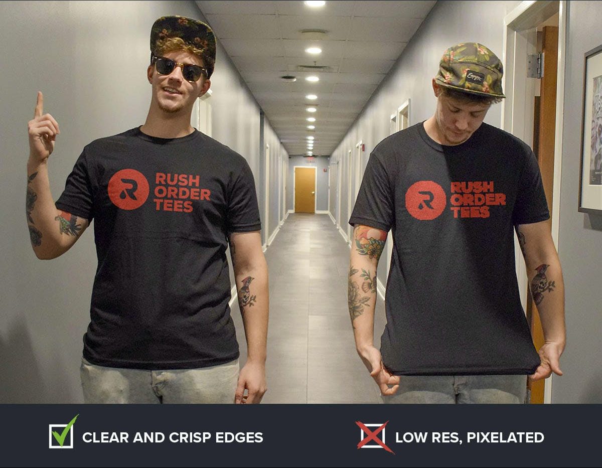
For optimum results, scan photos at a high quality. Try to locate the original if it’s a copy that has been resized or re-saved. If all you have is low-quality material and it’s difficult to correct, one solution is to use a distressed effect to make it appear as though it was intentionally roughed up.
Advice: Picture caliber Draw using vector graphics. The resolution is irrelevant when submitting a vector file because vector files scale well to print at any size without losing quality. And they often result in the crispest, clearest prints. We adore them the most because of this. The most common file types for vector files are PDF, EPS, AI, and SVG.

6. Be careful with colors
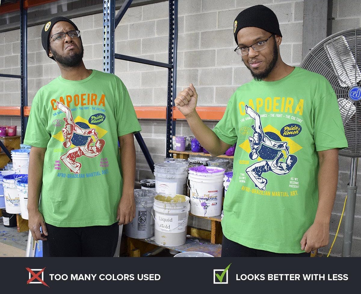
One of the most crucial selections is color. Making sure the task meets your budget is important, not just for design reasons but also if you want screen printing. More colors result in higher item costs. Usually, solid colors and a small color pallet work best for screen printing.
If you require special colors for your brand, we offer precise Pantone color matching in addition to our large variety of in-house ink colors that are available in the Design Studio.
The amount of colors as it relates to the budget is no longer a factor if your print method is DTG rather than screen printing because we will be printing in full color. It’s a fantastic option for gradients and mixes, especially with photos.
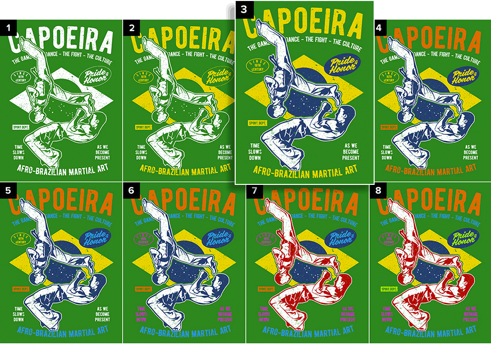
No matter the print technique, aesthetic considerations always include how the design appears due to color selections. It might be tempting to use more colors to make the design more vibrant, but doing so can backfire. If you choose too many colors, there is a greater possibility that they may clash, making your design unsightly.
There will nearly always be a perfect number of colors or a constrained selection of colors to pick from. People will wear the shirt more frequently if you use fewer colors to meet your design objectives than if you use all the hues of the rainbow.
Advice: ColorsAs soon as design work begins, colors should be on your mind. Colors may genuinely affect people in distinct ways. This is something that advertisers are very aware of, and you should be too. Researching the basics of color theory pays well. It will assist you in making the optimal secondary and tertiary color selections for your design.

7. Consider the contrast
Contrast is a unique and significant factor to take into consideration while choosing colors. What is contrast, exactly? It’s the visual contrast between an image’s brighter and darker areas or the way that different color tones relate to one another.
Low-contrast designs are more understated, whereas high-contrast designs are easier to read and more overt. Black-on-white or white-on-black is always going to have the most contrast. High contrast will result from using bright colors on a dark background.
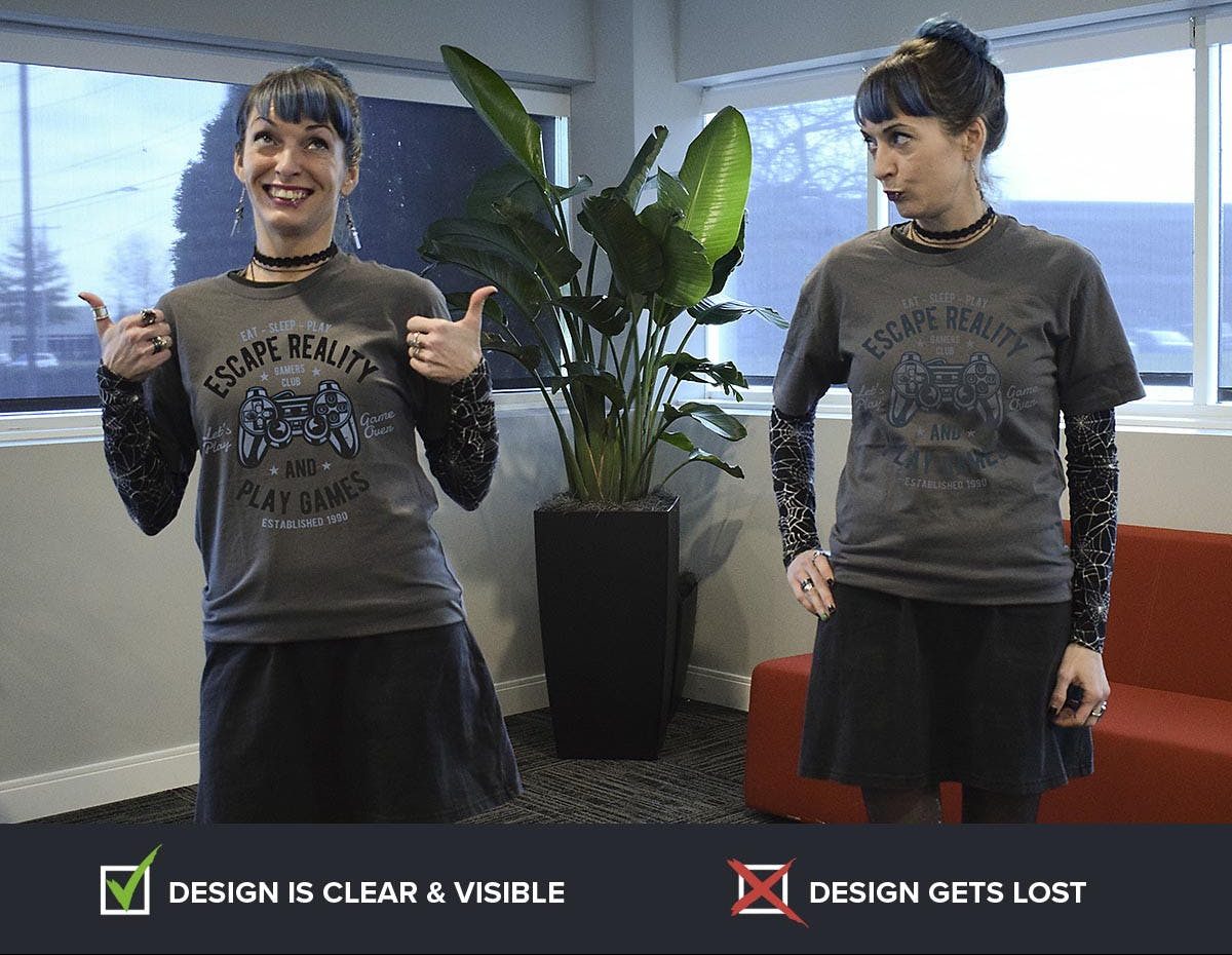
The design itself can determine the overall contrast, depending on the content and whether colors are prominent or have the largest surface area. The contrast will be significantly increased when compared to a neutral backdrop with a dramatic, attention-grabbing image and vivid colors.
Not always is achieving the maximum contrast desired. A low-contrast print has a delicate appearance that many people prefer. The finest designers sometimes experiment with low contrast. The line between that and no contrast, however, is quite thin.
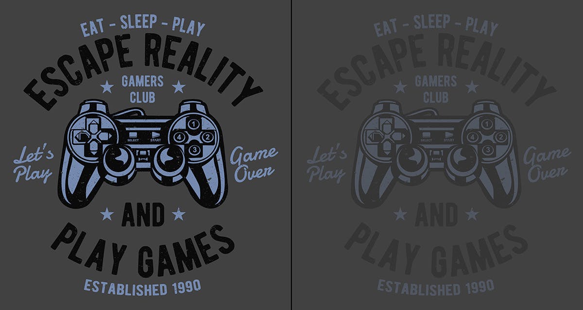
We frequently notice the following contrast errors: Navy on black shirts, Light Gray on sport gray shirts, and Ice Gray on white shirts. We do not advise these pairings since they have poor contrast.
Although it’s uncommon, we have printed black ink on black shirts when the customer needs a very faint appearance (yes, you can still see it). In order to prevent your order from being marked for rectification, please let us know if you’re attempting to set up anything similar.
Advice: Use contrast. Dark backgrounds cause darker colors to visibly go backward in space while lighter hues optically advance. The converse will happen on bright backgrounds: Darker colors will appear to move forward in space. As you lay out your design, make use of this impact.

8. Invert negative images
It is frequently necessary to do an inversion step when printing bright ink on dark fabric. You generally don’t want your shot to appear like an X-ray unless there is a special purpose for it.
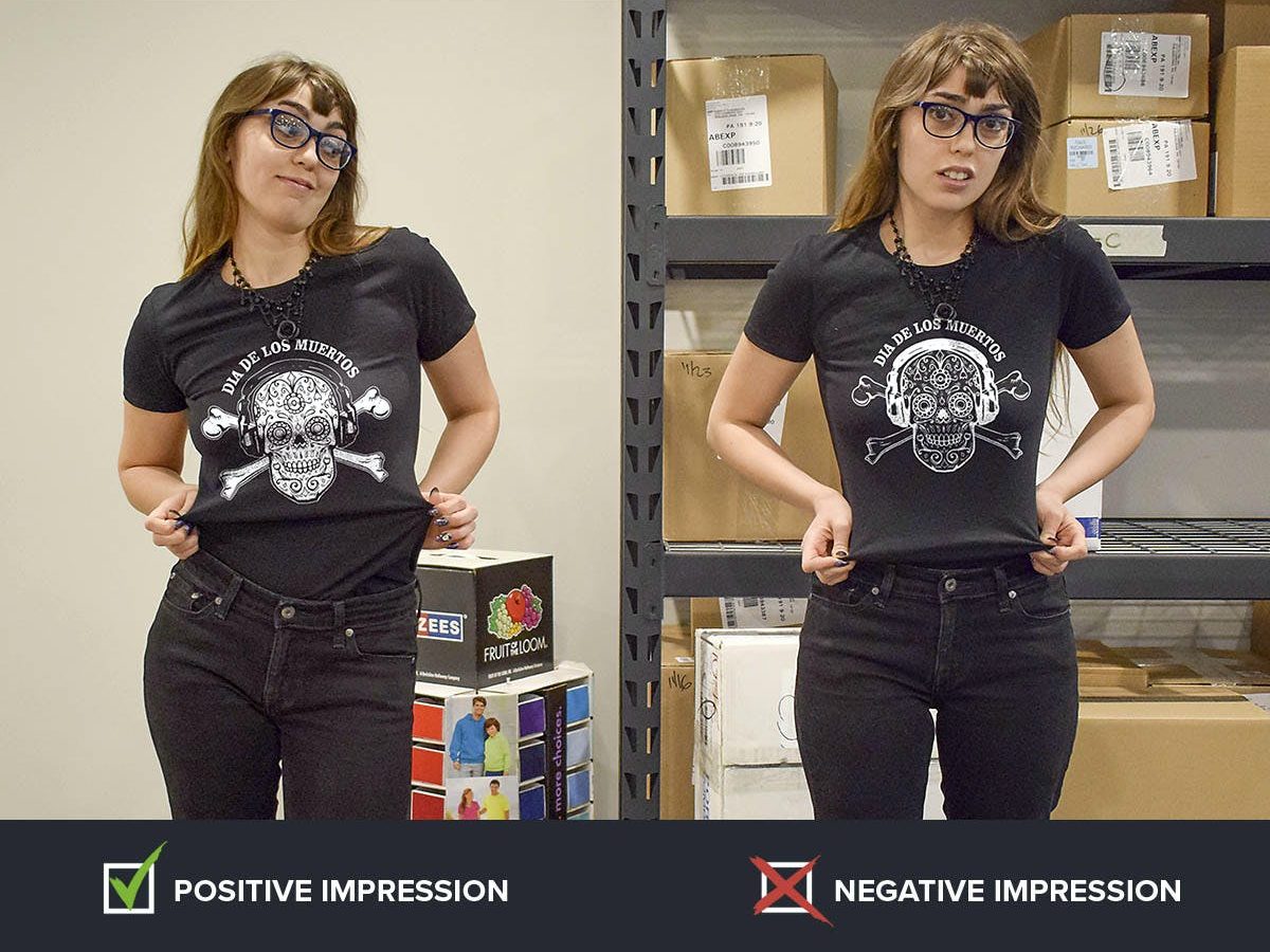
It might be challenging for the typical individual to determine whether something has to be inverted. Look for items that are often either black or white. For instance, the shadows of an eye should be black and the skull should be white. On dark clothing, white should frequently be used to fill in the lines rather than the other way around.
Adding a white outline is frequently necessary when a negative picture needs to be changed to a positive one. It’s advisable to hire someone to accomplish this for you if you aren’t a designer or at least comfortable using graphics software.
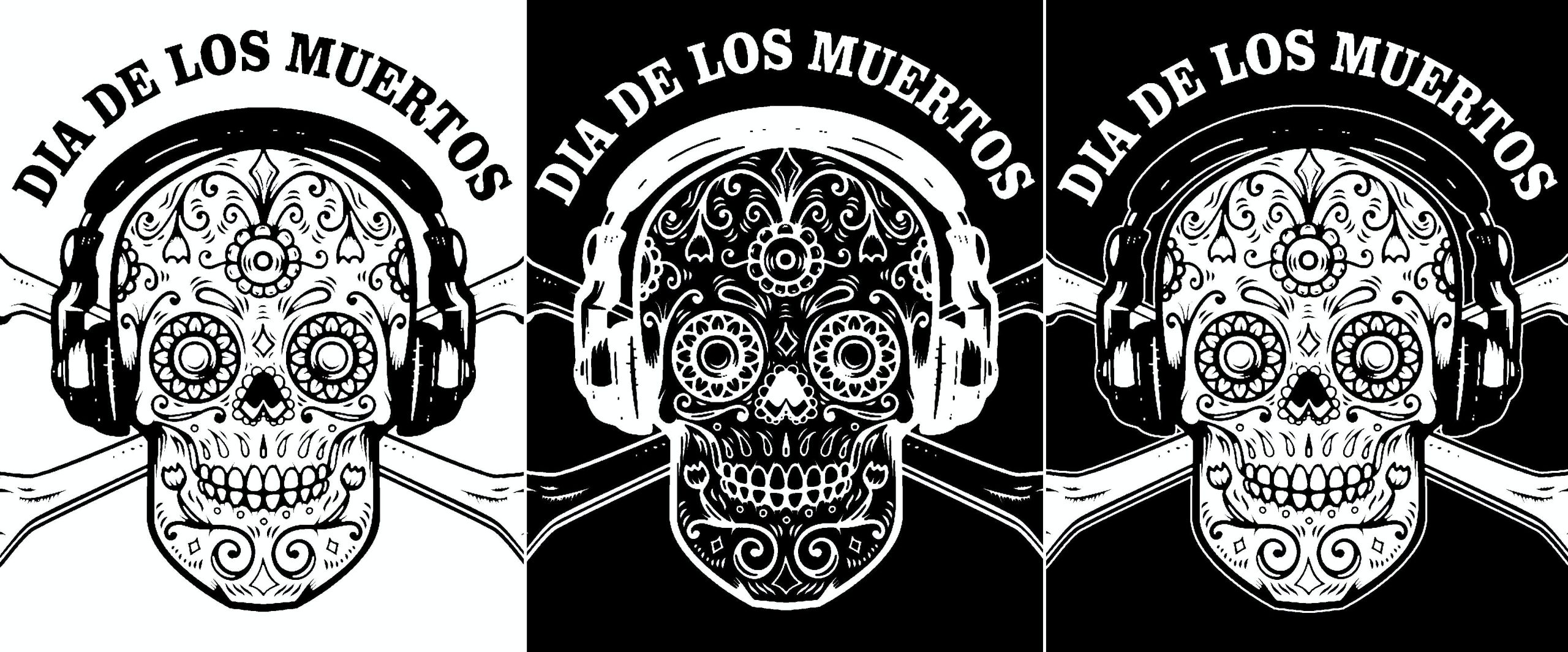
Our art department is pleased to provide free assistance with this. You may include a message with your order outlining your goals or speak with one of our project professionals who can assess your artwork and advise you on the best course of action.
Advice: Inversions If at all possible, wear only bright or dark clothing. Use two distinct patterns if your choice of clothing colors is erratic or a mix of bright and dark shades, as this increases the likelihood that the design will not look good on all of them. By choosing one, you can prevent this.

9. Avoid over-complexity
K.I.S.S. (Keep It Simple, Stupid) is a well-known aphorism that may be applied to everything, including T-shirt design. Probably only to complete the acronym, “Stupid” was added. Though unpleasant, the advice is sound.
The quantity of information that the human eye can comprehend simultaneously, whether it is visual or not, is limited. Additionally, a T-shirt design puts you in a moving target situation in addition to having a short-sight window. So keep it straightforward.
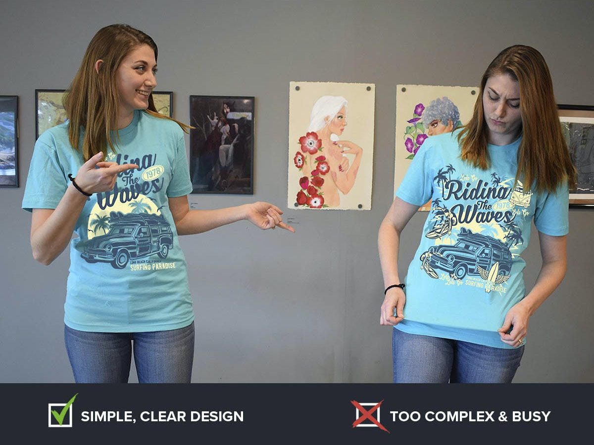
Sometimes when individuals are attempting to be creative, they might go a bit overboard and end up with a disorganized mess by piling objects on top of one another and employing strange angles and compositions. Sometimes the intricacy is increased by the type of design or the quantity of colors.
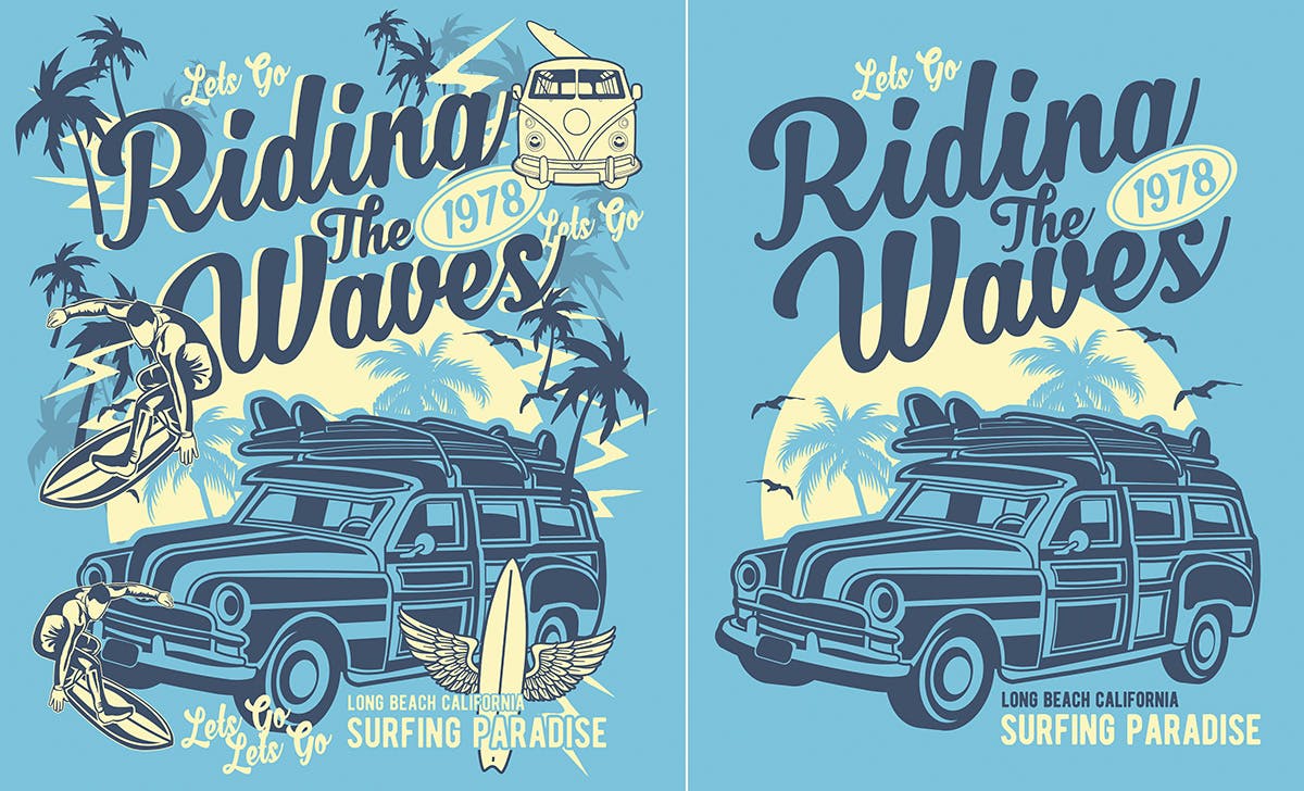
Nobody wants to have to try too hard to decipher what is written on your shirt. Remove anything that competes with or isn’t required to express your message after selecting one key image or topic.
Our skilled design team can assist if you’re having problems knowing whether to speak and when. In terms of “K.I.S.S.” ing, we are pros.
Advice: Complexity We frequently scrutinize a T-shirt up close when developing it. However, the majority of individuals won’t think so. Take a step back from your design and examine it objectively. Zooming out in your graphics application is another option for doing this. Is it simple to identify from a distance what it is? Once it can be read fast and clearly from a distance, your design should be simpler.

10. Add borders, masks, and edges
We print a lot of designs using pictures. The borders of a photo that is simply lying on a shirt might seem basic, cheap, or even unprofessional. Placing a border around it is an easy fix.
The choices for borders and edges are many. The simplest solution, which can quickly improve the appearance, is a thin white or black border. You might not, however, want it to be square. In such a scenario, you may utilize our Design Studio’s “mask” tool, which offers you a choice of form options.
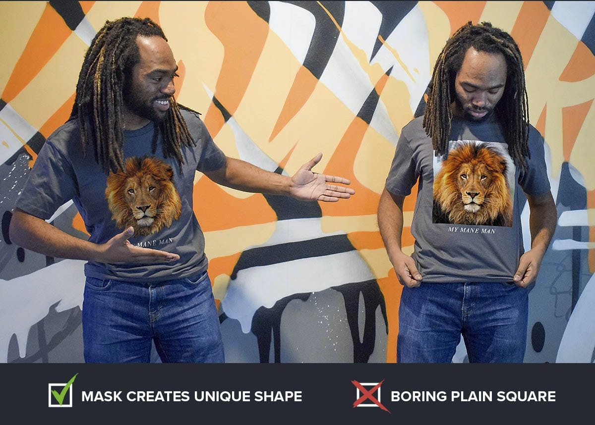
As an alternative, you might choose a thicker border with a more pronounced frame, occasionally with beautiful beveled edges, like in the images below. There are many different edge styles available in our clip art collection.
Think about your topic. If it’s for an anniversary, you could want a lovely frame. A competitive mudder competition could need broken edges. making a business shirt? You want something that appears professional and polished.
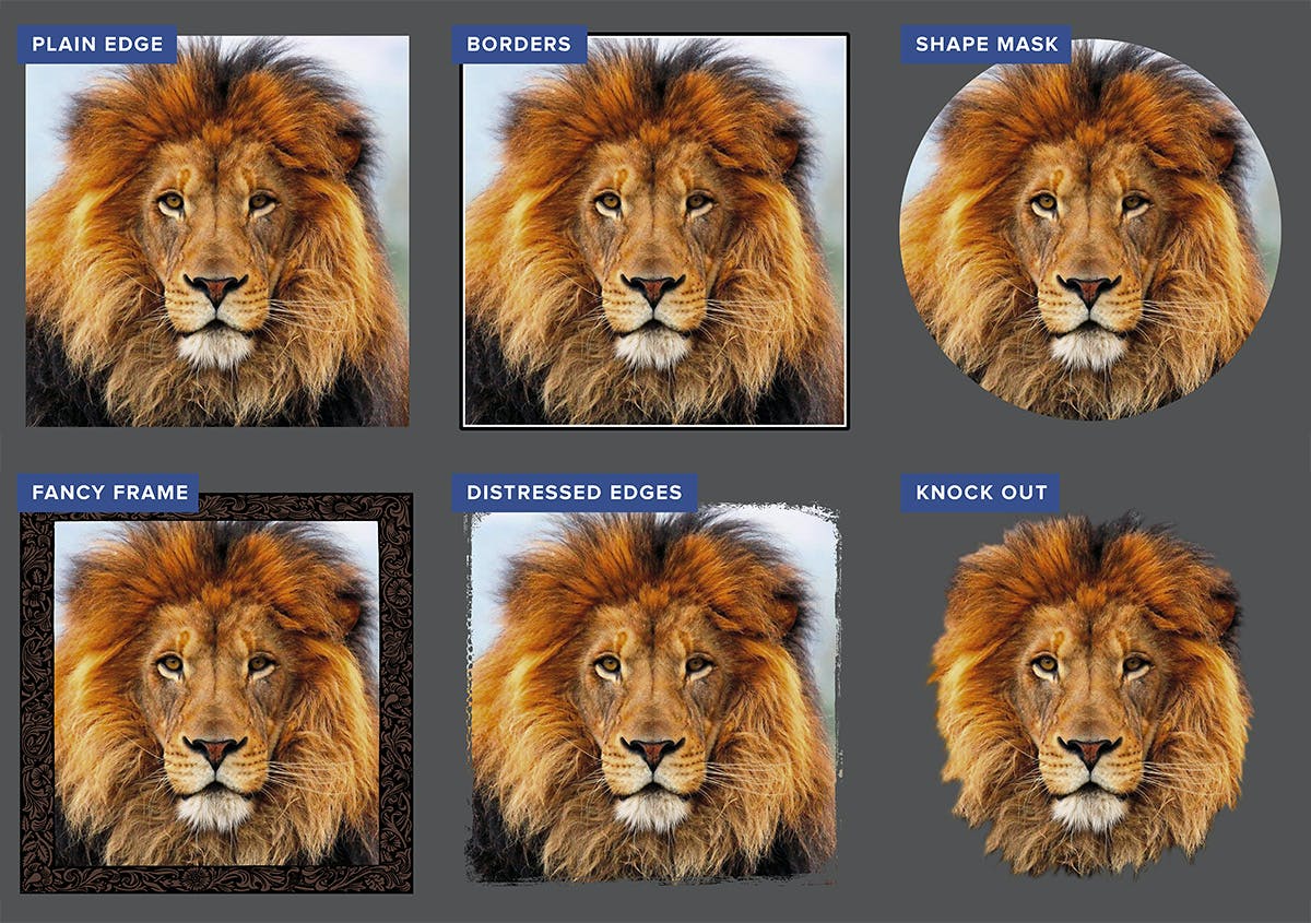
If you’re interested in any of these treatments but don’t own Photoshop or another image editing program, include a request with your order outlining your needs. There are free image editors online that function much like Photoshop if you want to try it yourself. Look them up.
Advice: Use borders and edges Have your topic break through the frame instead of just framing it for a dramatic 3D impact. There are several methods for doing this. The top of the skull poking through (in front of) the top border is the most typical. If you look at the majority of magazine covers, you will see that the subject is frequently shown on top of and partially encloses the magazine’s title. They do this because it advances the subject and provides visual appeal.


